I have posted separately the existing book covers I like, these individually have already given me lots of ideas to start with. This first book is from a Penguin Classic collection designed by Anthony Gormly, I love how simple it is the illustration is really beautiful, even though there is nothing complicated going on the designer has created something you want to touch and feel, it has a really expensive feel to it. I would love to be able to create such a simple but beautiful piece of work.

This second cover, is a modern interpretation of the book, what I like about this is the limited colour pallet. The blocked shapes and types I have previously mentioned on other book covers have not worked, but there is something about this one which really appeals to me and I think its the layout and colour which adds to it, there isn't too much going on and again although this design isn't as simple as the above this works really well for the style and approach the designer has taken. However I have to comment that this design isn't totally relevant and the image is slightly confusing, which overall doesn't really appeal to a young audience, more towards adults which is not the target audience.
There is something quiet strange about this cover, I don't like the peach stone, but the idea behind it is really strong. What I really like about this cover is the silhouette of the child and the concept of the peach stone, combined with the type works really well. I really like style of type chosen by the illustrator its playful and child like, it has found a nice balance between the information and image so not to be too blocky and separate they merge together really well.
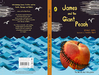
I don't like this book as an overall cover, however I have chosen to post it as this cover is the one I have had most inspiration from for my own cover. Before I saw this cover I dint really have a direction I wanted to take, but immediately collage and paper layers have come to life now from seeing this cover, I think this style will help attract both audiences as it will be vibrant in colour and texture but also capture the attention of the child like theme I want from my design, which may seem obvious but many of the cover I have posted don't necessarily focus on the child as its target audience.
This is beautiful, I love the carvings on the peach with the different characters and elements from the story, I feel this alone would be enough for the cover without the birds carrying the peach I don't like the combination of photograph with illustration. The only other thing I feel could be developed with the cover is, the title doesn't jump out at you, your directed towards Roald Dahl initially. This cover has given me lots of ideas similar to Rob Ryans work, one colour cut outs, this could be a really interesting concept for the book.


No comments:
Post a Comment